High-level concept image for the Joy app showing a phone mockup with the Joy splash screen against a deep purple gradient background, alongside the Joy app icon featuring a trans pride flag-inspired design. Text reads: JOY — Your AI-powered HRT companion.

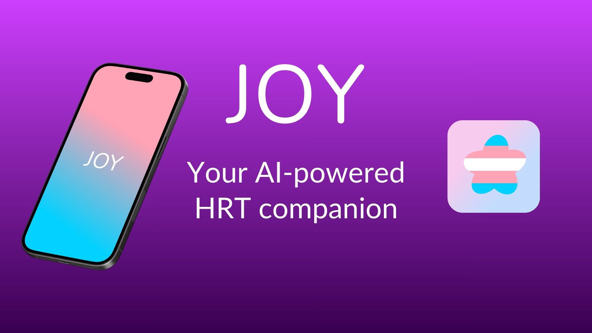
Joy — an AI-powered companion built specifically for people navigating hormone replacement therapy (HRT). Designed in 24 hours at the BRIDGEGOOD AI Hackathon for Social Good.

The Pivot
Halfway through the hackathon, our original idea fell apart.
It was too broad, not grounded enough in real user needs, and impossible to validate in the time we had. So we did the only thing that made sense — we scrapped it and started over.
That reset led us somewhere clearer and more human: transgender individuals navigating HRT often rely on scattered resources, generic health apps, and systems that don't reflect their lived experiences — all while worrying about who can access their personal data.
This wasn't a pivot away from failure. It was a pivot toward honesty about what actually needed to exist.
The Problem
As the team explored the space, the gaps were hard to ignore.
HRT resources are scattered and difficult to verify. Most health apps are generic and not transition-aware. People worry about where their medical data goes and who can access it. And the healthcare system consistently overlooks the emotional side of transition — treating it as a clinical process rather than a deeply personal one.
This wasn't just a usability problem. It was a trust problem. And in healthcare, trust is everything.
The existing tools asked users to adapt to the product. Joy was designed to adapt to them.
How might we design an AI health companion that makes people navigating HRT feel supported, seen, and safe — without asking them to sacrifice their privacy to get there?

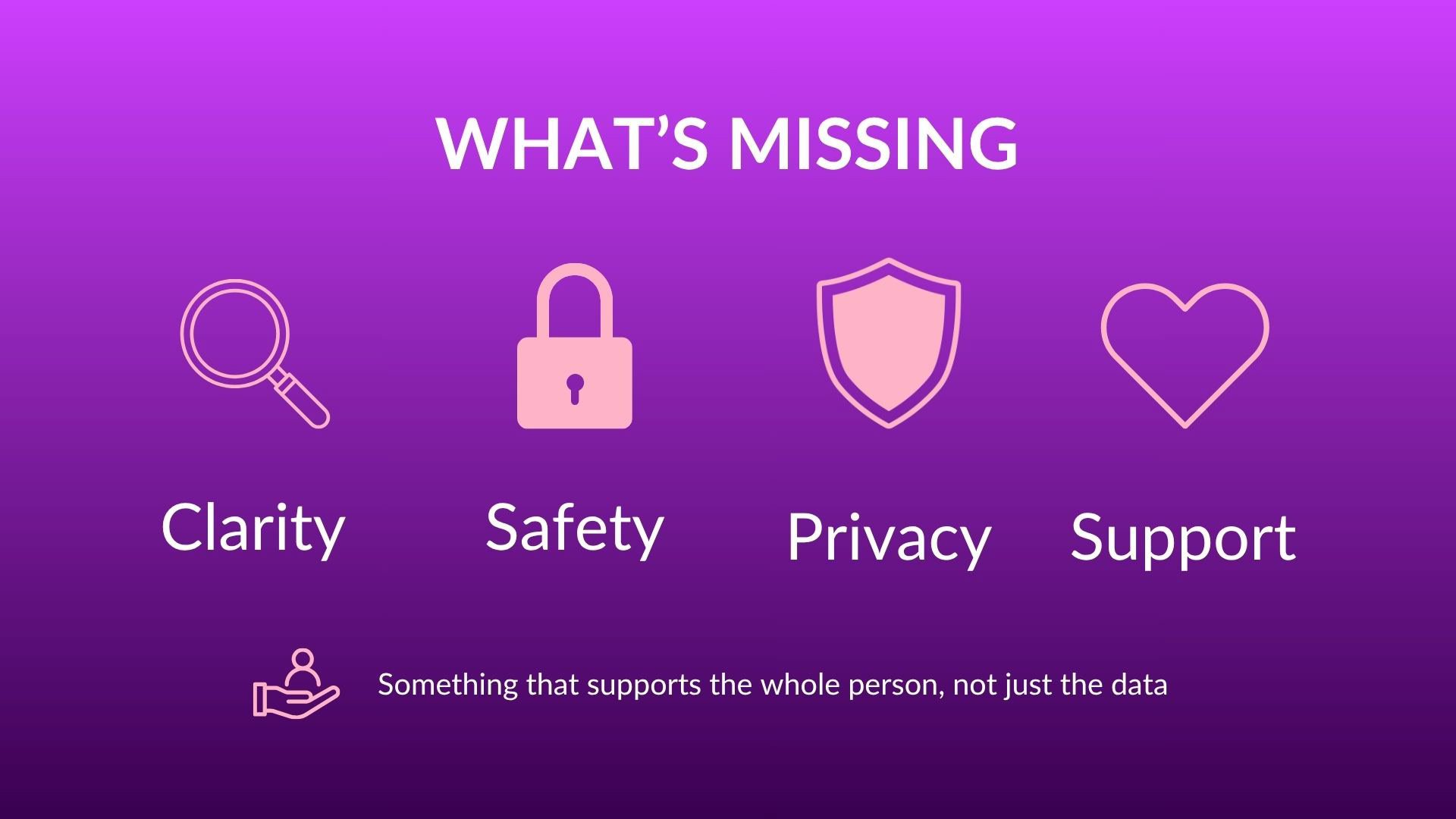
What existing HRT tools were missing — the four gaps that shaped every design decision Joy was built around.

Impact Framework
Before designing a single screen, the team aligned on what Joy was actually trying to do in the world.
Three outcomes drove every design decision:
Access: improve access to affirming care for people who have historically been underserved or excluded by mainstream healthcare tools.
Outcomes: support better health through consistent, personalized tracking that connects physical and emotional patterns.
Connection: reduce isolation through daily emotional support that meets users where they are.

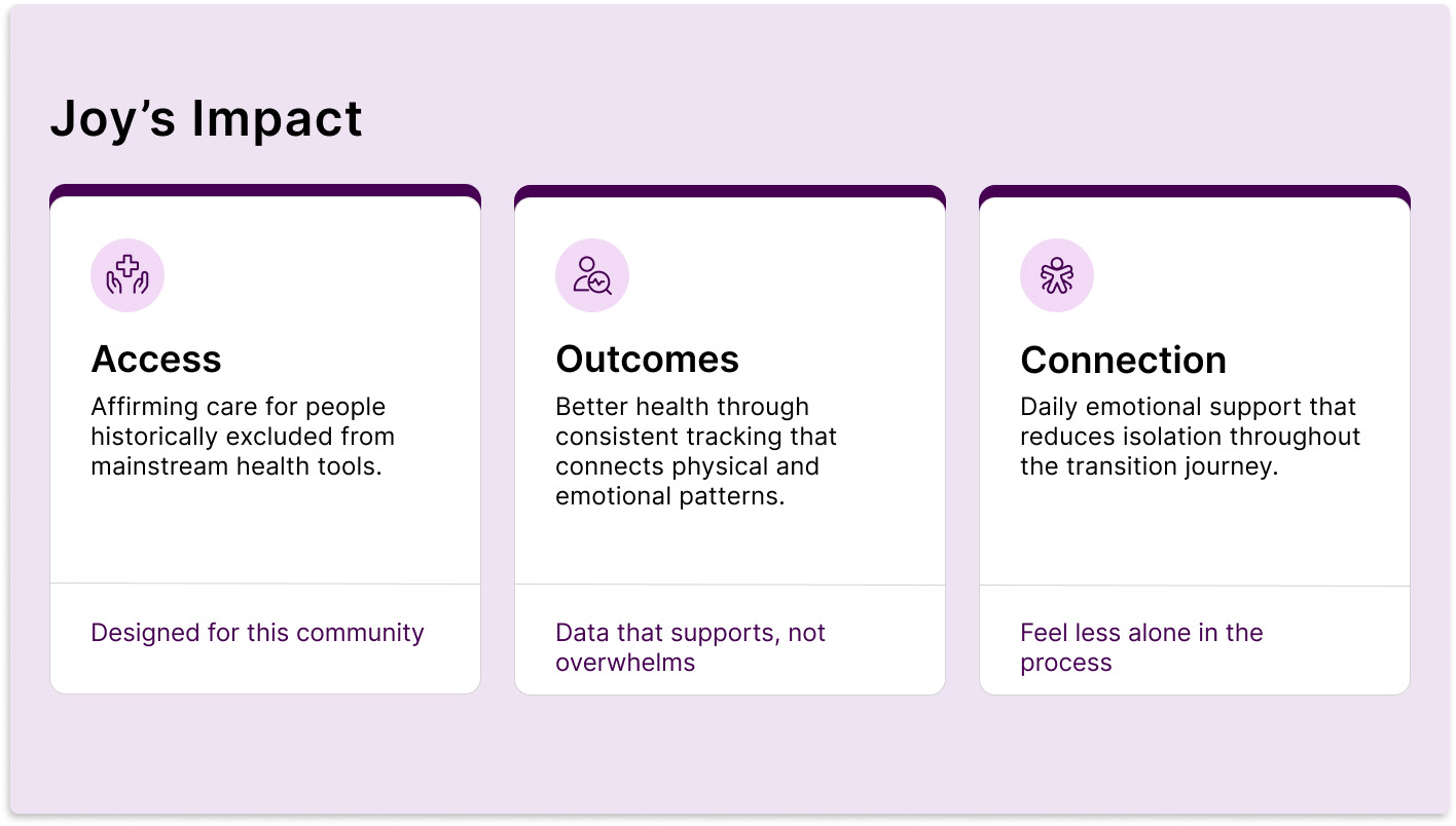
Joy's three impact pillars — access to affirming care, better health outcomes, and daily connection that reduces isolation. These drove every design decision.

Research & User Framing
With 24 hours on the clock, research had to be fast and focused. The goal was to design from grounded understanding — not assumptions.
Secondary research covered existing HRT tracking tools, privacy risks specific to LGBTQ+ health data, and design patterns from mental health apps that successfully build trust with vulnerable users.
From that foundation, the team defined a clear user persona before any UI work began.
The Joy user is:
Early in their HRT journey or actively managing long-term symptoms
Navigating a healthcare system that doesn't always make them feel seen
Cautious — rightfully — about where their health data goes
Looking for support, not surveillance
Key emotional states held throughout the design process: hopeful, anxious, cautious, underserved.
These weren't decorative descriptors. They were a design filter applied to every screen, every label, and every AI interaction.
Privacy-First Design — The Non-Negotiables
Privacy wasn't a feature. It was the foundation everything else was built on.
On-device AI processing: data stays on the user's device, works offline, and never passes through external servers. This was a technical and ethical commitment made early and held throughout.
No third-party data sharing: Joy doesn't sell, share, or transmit personal health information. What's entered stays local.
Anonymous access: users can engage with Joy without creating an account, providing an email, or linking any identity. Anonymity is the default, not an opt-in.
Inclusive language throughout: every prompt, label, and AI response was written to avoid gendered assumptions. Pronouns are user-defined. The language is transition-aware, not transition-generic.
Non-clinical AI tone: Joy communicates like a knowledgeable, supportive companion. Not a medical portal. The voice check-in feature uses trauma-informed language specifically designed to reduce anxiety and meet users in difficult emotional moments.
Calm visual language: the visual system was designed to feel like a sanctuary. Soft gradients, warm tones, generous spacing. The opposite of a hospital dashboard.
Mobile screen of the Joy app home interface against a trans pride flag-inspired pink-to-blue gradient background. The screen shows a Voice Check-In module labeled 'Private by default' and 'On-device', a microphone button, example prompts, and a note reading 'All speech recognition happens on your device. No audio is sent to servers.' Below is a mood check-in row with emoji options labeled Low, Neutral, Okay, Affirmed, and Euphoric. Navigation tabs show Home, Calendar, Analytics, and Journey.

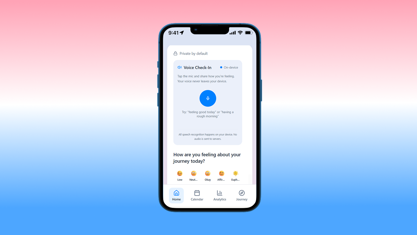
The Joy home screen makes privacy visible — not buried in settings. "Private by default" and "On-device" labels appear directly in the UI, so users never have to wonder where their data goes.

Core Features
Medication Calendar: A structured view for tracking HRT schedules, dosage history, and upcoming appointments — with proactive check-in prompts that feel supportive rather than clinical.
Mood Analytics Dashboard: Tracks emotional patterns over time and surfaces insights in plain language. No charts that require interpretation. No color-coded warnings. Just clear, readable observations that help users understand their own patterns.
HRT Milestone Predictions: Personalized timeline showing predicted milestones based on common transition experiences — framed explicitly as guidance, not rigid expectations. Reduces anxiety by setting realistic expectations early.
Voice Check-Ins: Short, trauma-informed voice interactions that support emotional well-being between appointments. Designed for moments when typing feels like too much.
A Figma-designed graphic titled Why AI Matters in bold black text on a light purple background. Three white cards are displayed side by side, each with a dark purple top border accent. Left card: a light purple circle icon showing a lightbulb, bold label reads Mood insights, description reads detects mood trends over time to surface patterns the user might not notice alone. Center card: a light purple circle icon showing a padlock, bold label reads Device Privacy, description reads all AI processing happens on-device only, no data leaves the user's phone. Right card: a light purple circle icon showing a flag, bold label reads Milestones, description reads timeline predictions based on common HRT experiences framed as guidance not rigid expectations. Below the three cards is a light gray footer strip with a phone icon and text reading Use insights to talk with your care team — Joy surfaces patterns, your doctor makes decisions.

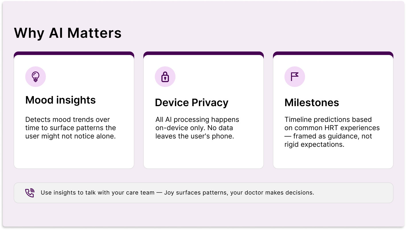
The three AI-powered features that make Joy different — designed to surface patterns, protect privacy, and set realistic expectations without replacing professional care.

Prototype
The interactive prototype was built in Lovable.com, moving from Figma designs to a working clickable experience within the 24-hour window.
The core user flow covers:
Entering the app without account creation
Completing a mood and symptom check-in
Viewing the tracking dashboard and milestone timeline
Interacting with the AI companion via voice or text
The prototype was the artifact that won the room — it made the concept tangible and communicable to judges under real time pressure.

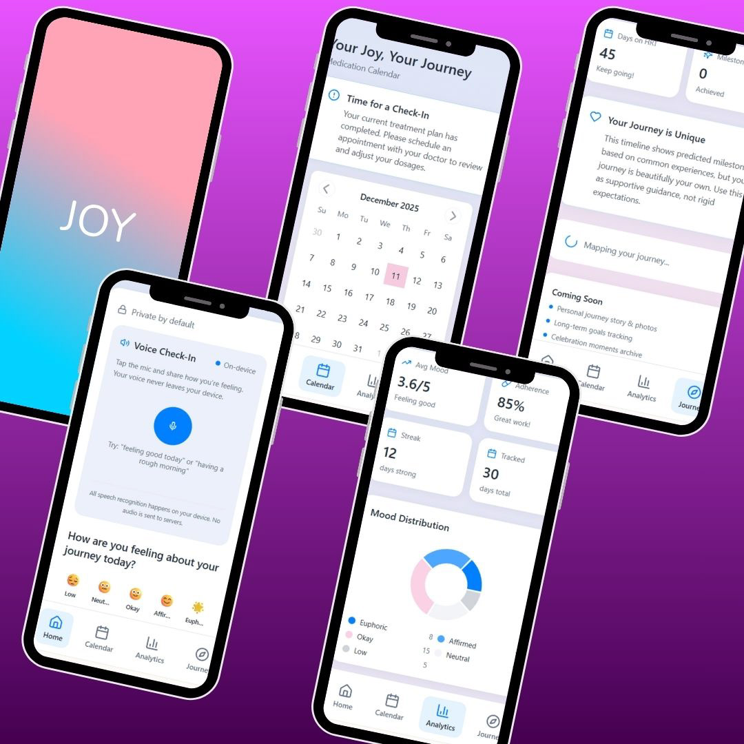
Core experience flows — medication calendar, mood analytics, and personalized HRT milestones — designed to connect physical and emotional health in one place.

Turning the Prototype Into a Story
After the hackathon, the team wanted to communicate Joy clearly and respectfully in under two minutes. So the production process itself became a design challenge.
AI tools were used intentionally — not as shortcuts, but as a way to move fast while staying careful about tone, clarity, and accessibility:
ChatGPT for storyboarding and script drafts
ElevenLabs for voiceover
Pexels for stock video reflecting healthcare disparities
Canva as the editing hub for slides, app demos, and subtitles
Figma to confirm accessibility and WCAG AA color contrast standards throughout
Using AI to explain an AI product felt a little ironic — but it was the right call. It allowed the team to stay intentional about how Joy was presented to the world, not just how it was built.

A still from the Joy product walkthrough — a two-minute video produced using AI tools to communicate the concept clearly, accessibly, and respectfully after the hackathon.

What the Judges Recognized
Joy was selected as runner-up at the BRIDGEGOOD AI Hackathon with a community-sponsored cash prize.
The recognition came specifically for problem framing and UX clarity — not just the prototype. That distinction matters. It means the thinking behind the work landed, not just the visuals.
What the team built in 24 hours wasn't a finished product. It was a clear, grounded argument for what a privacy-first, emotionally intelligent health app could look like for a community that existing tools have consistently failed.
What I Learned
The pivot was the project. Scrapping the original idea halfway through and starting over was the best design decision made that day. It forced clarity about what actually needed to exist — and that clarity is what made Joy work.
Constraints clarify values. With 24 hours, there was no time to design everything. That forced a real answer to the question: what does this product actually stand for? Privacy and emotional safety came first. Everything else followed from there.
Designing for a vulnerable community requires humility. Secondary research and personal connection gave this project its grounding — but a full version of Joy would require co-design with HRT users, not just design for them. Your output is only as good as your input.
AI tone is a UX problem. How the companion speaks is as much a design decision as how it looks. The language choices: what words to use, what to avoid, when to acknowledge emotion before offering information — are interface decisions with real consequences for how safe a user feels.
If I had more time:
Conduct direct interviews and co-design sessions with HRT users
Design the full onboarding flow with transparent, human privacy consent — not a legal disclaimer
Build and test the settings and data control screens
Explore on-device AI model options to technically validate the privacy architecture
A/B test AI companion tone variants with real users
Designing Joy pushed me to think beyond screens and into ethics, privacy, accessibility, and emotional safety — especially when AI is part of the experience.
That's the lens I bring into every project now: not just making things look good, but making sure they actually improve people's lives.
Thank you to teammates Jessica Alcantar, Aiden Leong, and Shirley Yang, and to BRIDGEGOOD, Change Agent AI, Dashbase, and Lovable for creating space for projects like this to exist.
This case study uses semantic headings and live text to support screen readers. All images include descriptive alt text. Content is structured for assistive technology compatibility. WCAG AA color contrast standards applied throughout the Joy UI.

You may also like

Back to Top