Preview of redesigned dog services website homepage showing multiple sections including a hero banner with a dog image and call-to-action, services and pricing cards, about section with owner photo, customer testimonials, and a contact call-to-action section, all presented in a clean desktop layout.

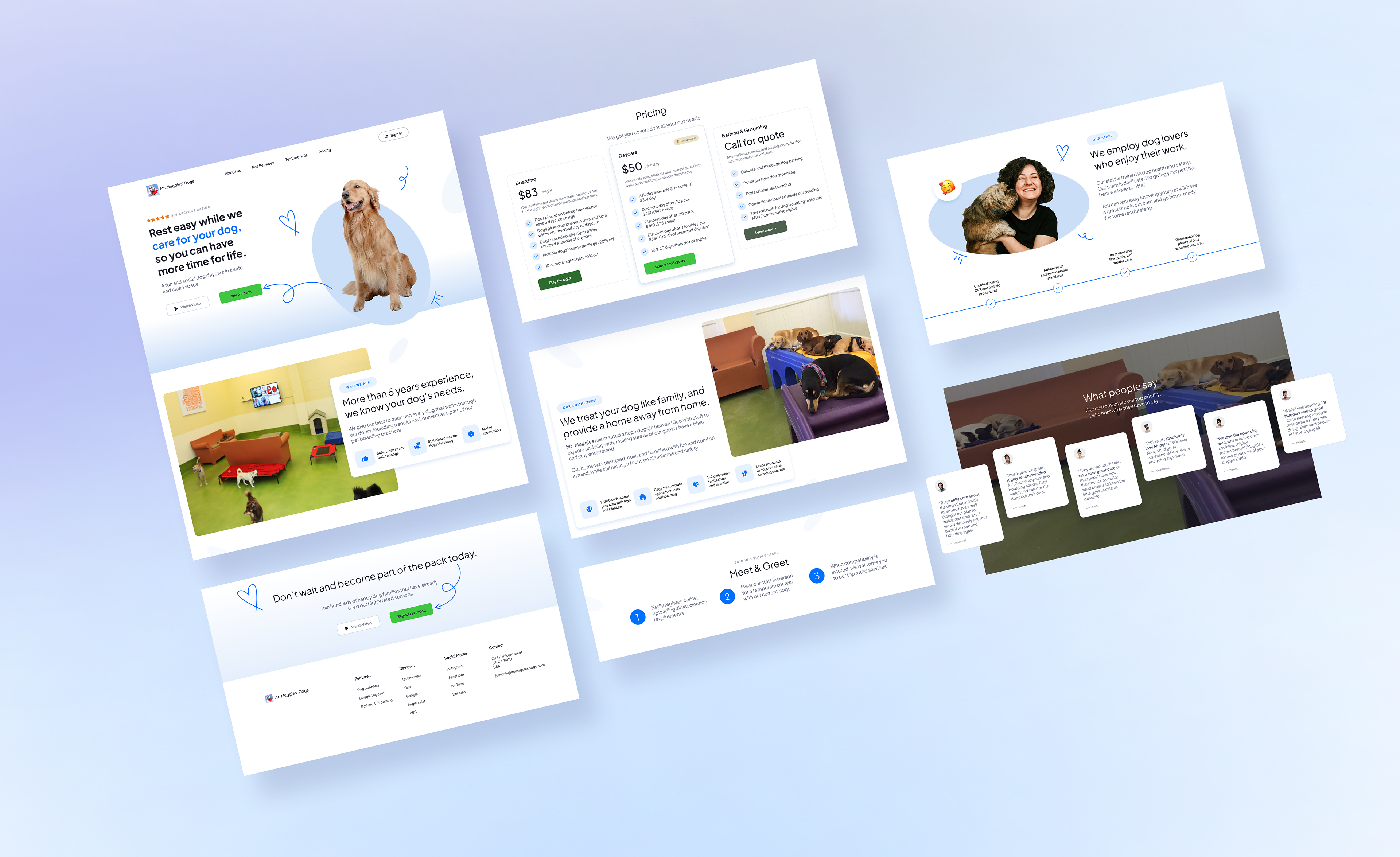
Homepage redesign overview showing key sections including the hero, services, pricing, about, testimonials, and contact call-to-action, designed to improve clarity, trust, and booking flow.

The Problem
The original homepage buried key information, lacked visual hierarchy, and offered only one path to register: a phone call. For a first time visitor, that's a high effort ask before they've been given any reason to trust the business.
Three core problems to solve:
No clear service structure or trust signals above the fold
Weak visual hierarchy, users didn't know where to look
Phone only registration created friction and likely caused drop-off
How might we help first-time visitors understand what Mr. Muggles' Dogs offers and feel confident enough to register — without picking up the phone?
Annotated screenshot of the original pet daycare homepage hero section with handwritten notes identifying problems including weak CTA placement, missing trust indicators, and cluttered layout.

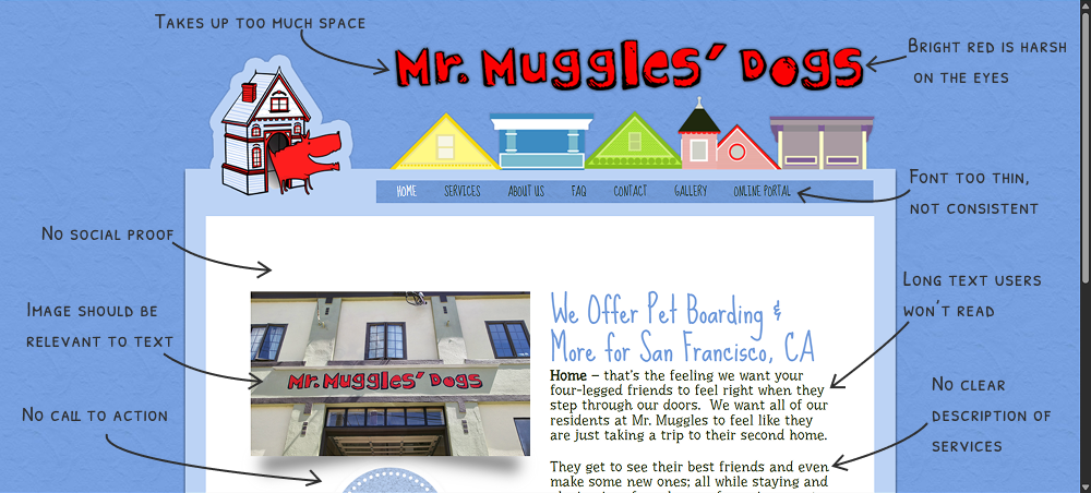
The original hero section lacked a clear call to action, had no trust signals, and used dense text with no visual hierarchy to guide the user.

Research
Competitive Analysis
I audited 3 competing pet care websites to identify layout patterns, trust conventions, and registration flows that users already recognize. Key findings: the strongest sites led with social proof, clearly differentiated services, and kept registration to three steps or fewer.
User Interviews — 3 Participants
After completing competitive research, I created three wireframe variations of the homepage layout and tested them in one round of interviews with peers from my student cohort.
What I was looking for:
Which layout communicated services fastest.
Where users' eyes went first and whether it matched intended hierarchy.
What information users needed before they'd feel confident clicking "Register".
Three wireframe variations of a pet daycare homepage layout shown for comparison, each featuring different arrangements of the hero section, service descriptions, and call-to-action placement.

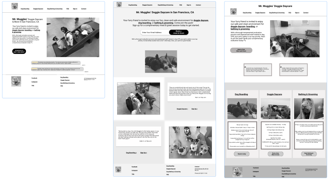
Three homepage wireframe layouts were created after competitive research and presented to participants during user interviews to identify which structure best supported clarity and trust.

What Participants Said
These are the synthesized takeaways across all three interviews, organized by theme:
Registration & Forms
All three participants wanted to register directly on the site — no phone calls, no email.
The first and last steps of the sign-up process felt unclear.
A calendar option for scheduling the meet and greet was requested.
Confirmation messaging needed more detail (hours, what to bring, what to expect).
Information Hierarchy
Pricing should appear higher on the page.
The meet and greet introduction and its purpose should come early — not be buried.
Customer reviews and employee spotlights can live lower on the page.
Repeated information between "What to Expect" and "Our Requirements" should be consolidated.
Trust & Facility Presentation
Interior facility photos were important for decision confidence.
"Call or email us" text should be a hyperlink — not plain text.
What Worked
Participant 1: "The information is good, I just want more pictures of inside the facility."
Overall information and images were described as "good" — the content was there, the structure needed adjustment.
Diagram illustrating user scanning behavior on a desktop landing page, showing an F-pattern or Z-pattern eye movement, a 5-second decision window marked at the top, and an exit point indicated for users who do not find immediate clarity. Based off of insights from Michal Malewicz at squareblack.com.

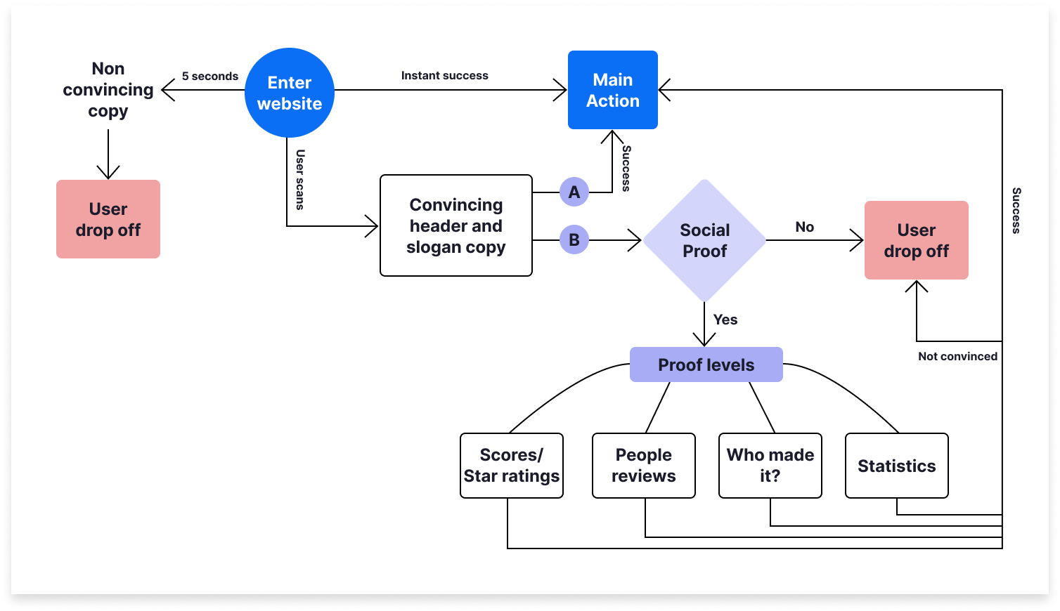
A visual reference showing how users scan landing pages — prioritizing the top of the page and exiting quickly if clarity isn't established within the first 5 seconds. Based off of insights from Michal Malewicz at squareblack.com. 

From Interviews to Final Wireframe
Using feedback from all three participants, I revised the layout into a single final wireframe. The changes were direct responses to the interview data — not assumptions.
Key structural decisions made from research:
Moved pricing section below business about section.
Introduced the meet and greet concept and its purpose near the top.
Moved reviews lower — they're trust support, not the lead.
Replaced "call or email" plain text with clear call to action, "Join Now".
Added a calendar selection step to the 3-step registration form.

The revised wireframe reflects direct changes from user interview feedback — restructured hierarchy, consolidated sections, and a redesigned registration entry point.

Homepage Design
The final high-fidelity homepage was designed to answer three questions in sequence as the user scrolls:
What do you offer? Services are defined clearly above the fold — no jargon, no guessing.
Can I trust you? Owner introduction, facility photos, and testimonials appear early in the scroll, not at the bottom.
How do I get started? One primary CTA, consistent throughout the page, using specific action-oriented language.
Annotated high-fidelity mockup of the redesigned pet daycare homepage hero section, with arrows pointing to the updated call-to-action button, revised headline, trust badge placement, and improved visual hierarchy.

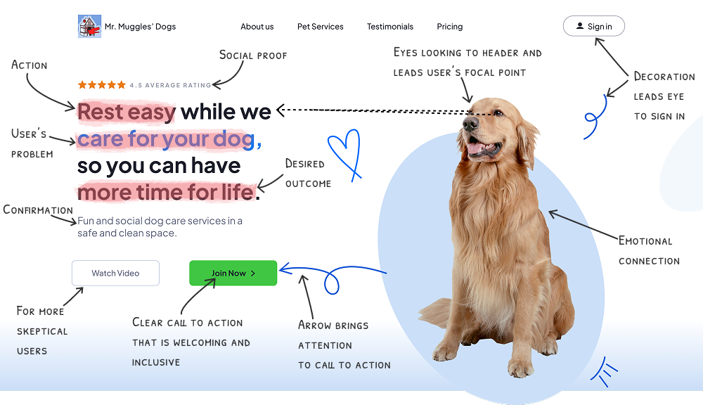
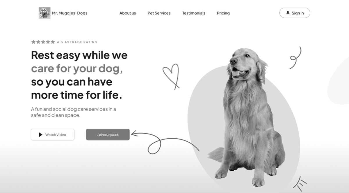
The redesigned hero section with annotation — highlighting updated CTA language, trust signal placement, and visual hierarchy decisions made in response to interview feedback.

Flowchart or customer journey map showing the homepage content sequence from hero section through services, meet and greet introduction, facility photos, pricing, testimonials, and registration CTA, with labels indicating the user need each section addresses.

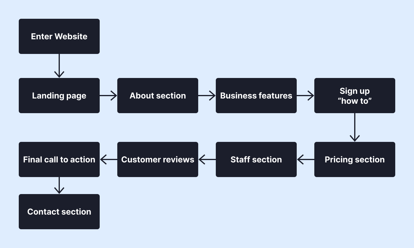
A section-by-section scroll flow of the homepage, mapping each content block to the user's question it answers and the action it supports.

Full desktop high-fidelity mockup of the redesigned pet daycare homepage, displaying the hero section, service categories, meet and greet introduction, facility photography, pricing section, client testimonials, and registration call-to-action in a clean, professional layout.

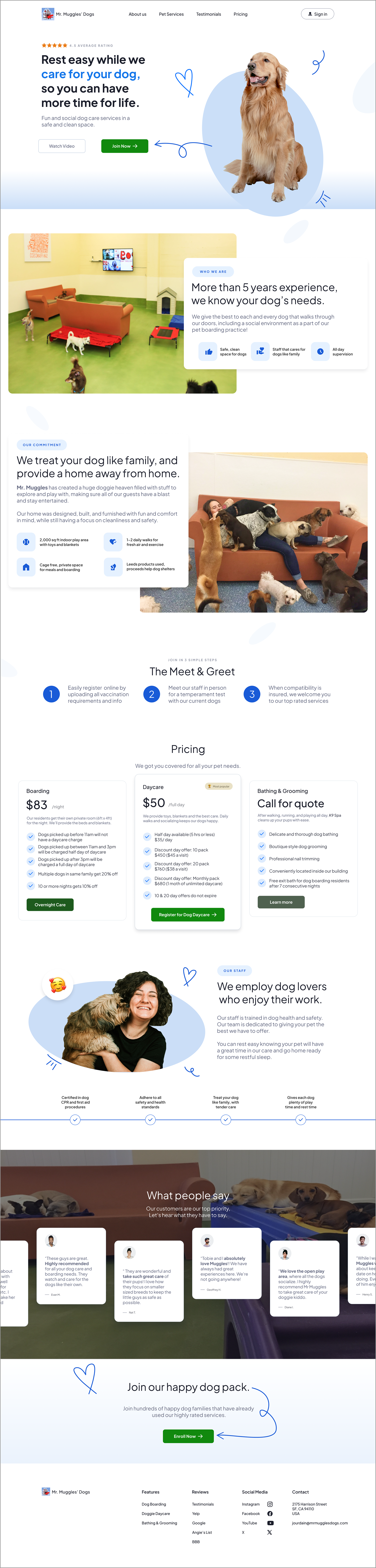
The complete redesigned homepage — structured to guide the user from first impression through to registration with minimal friction.

The Registration Flow — From Phone-Only to 3-Step Form
The biggest friction point in the original experience wasn't the homepage — it was the registration process. Requiring a phone call as the first step asked for high commitment before the user had enough information to feel confident.
The redesign replaces this with a 3-step online form structured around progressive commitment: start easy, build trust, confirm next steps.
Step 1 — Owner Details: Name, phone, email and dates of care needed. Low stakes, easy to complete. This is the small "yes" that gets the user moving and invested.
Step 2 — Tell Us About Your Dog: Name, breed, age and size, vaccination records. Fields are grouped logically and only what's needed is required.
Step 3 — Schedule The Meet & Greet: A quick explanation of the meet & greet process, Google star rating to build trust, and business hours. Drop down menu for times to select and a calendar lets the user choose a date for the in-person temperament test. By placing scheduling at the end, the user has already provided context — making follow-through far more likely than if a phone call had been the opening ask.
Dog service registration step 1 screen showing a progress bar at the top, form fields for name, phone number, and email on the left, and a calendar date picker for selecting service dates on the right, with a green “Continue to step 2” button at the bottom.

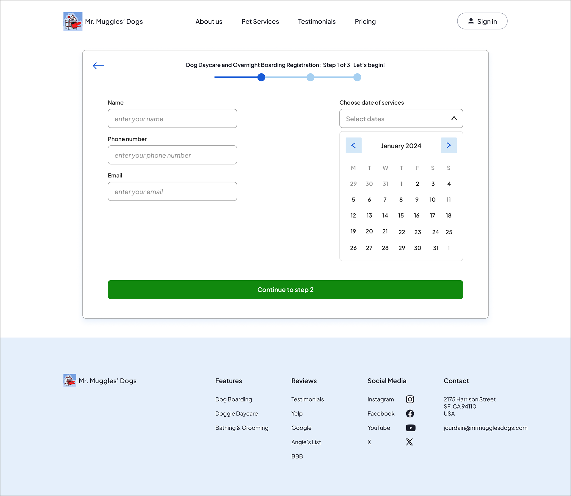
Step 1 of the registration flow collects owner contact information and service dates, using a progress indicator and simple two-column layout to reduce cognitive load and guide users through the process.

Dog service registration step 2 screen showing form fields for dog name, breed, weight, and age on the left, and file upload sections for vaccination records and spay/neuter documentation on the right, with a progress indicator and a green “Go to last step” button.

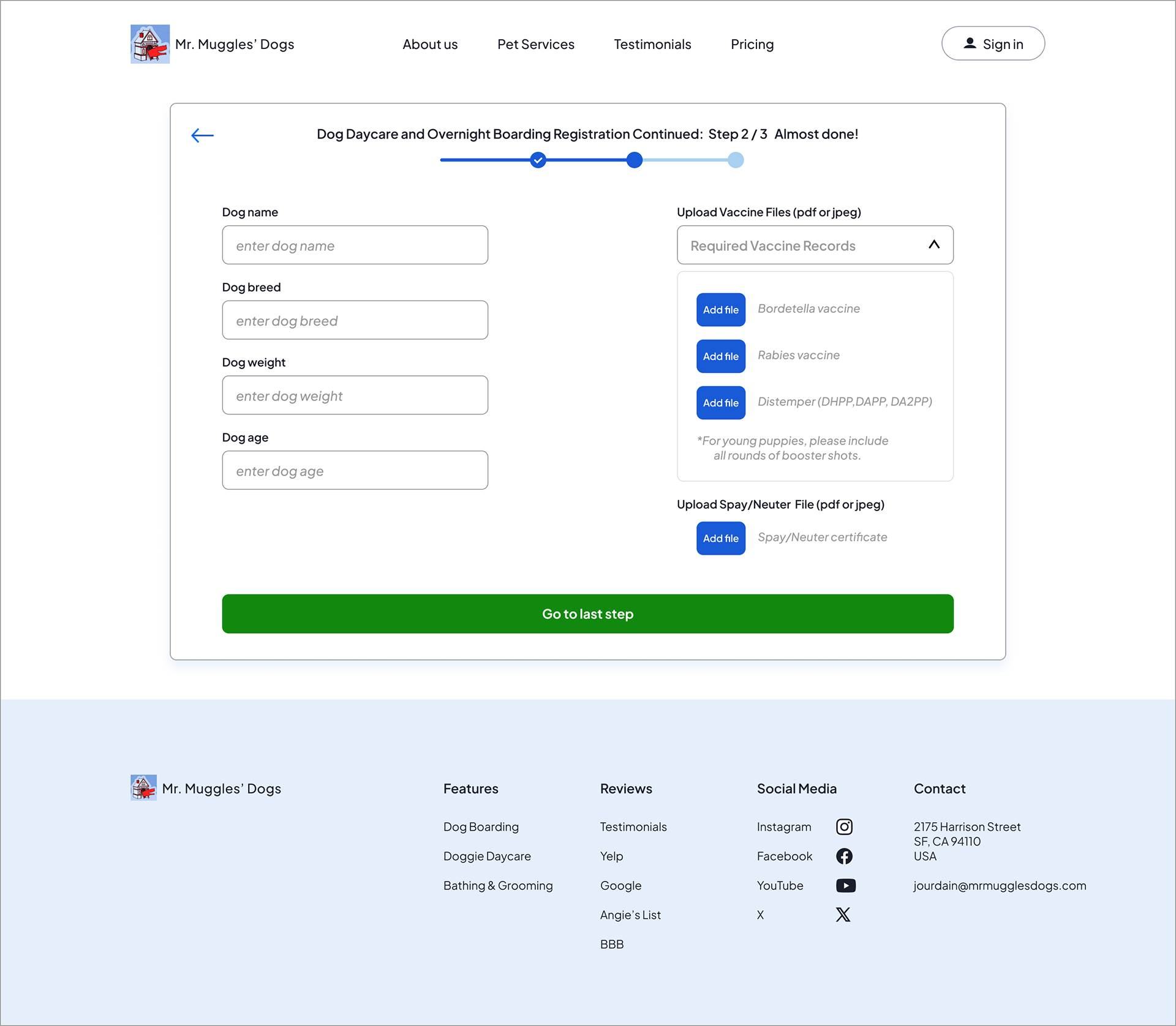
Step 2 collects dog information and required vaccination records, organizing complex requirements into a clear, structured layout to make the process feel manageable and transparent.

Dog service registration step 3 screen showing meet and greet information, a time selection dropdown, special care instructions text box, and a calendar date picker, with a progress bar at the top and a green “Complete Registration” button.

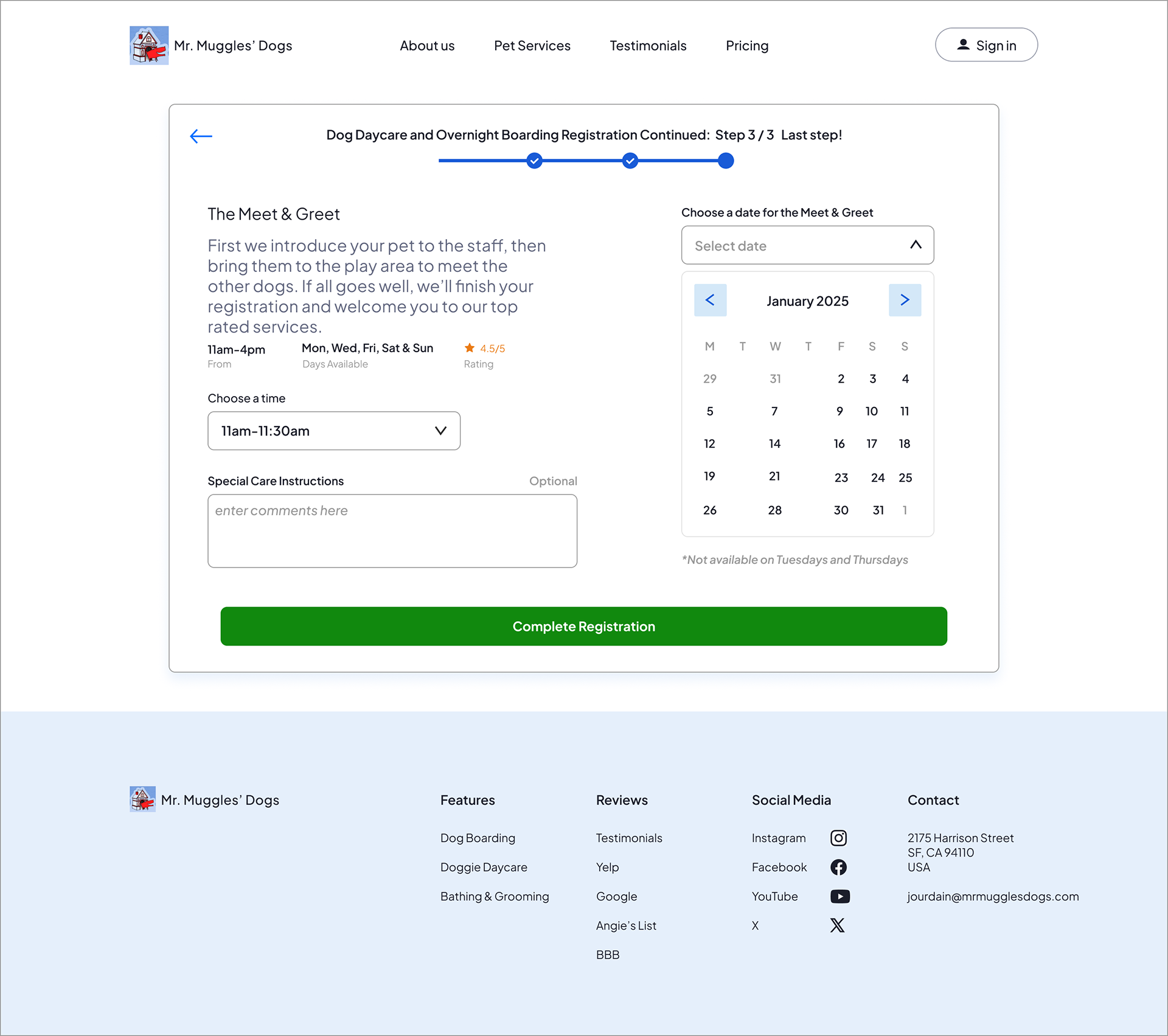
Step 3 schedules the required meet and greet, explains what to expect, and allows users to select a date and time before completing registration.

Visual Design
The visual system was designed to feel professional and warm without being playful or cluttered. The goal: signal that this is a real, established business — not an Etsy pet blog.
Neutral background with consistent spacing and clear breathing room
Limited color palette — applied intentionally, not decoratively
Heading hierarchy that guides the eye without requiring reading
Typography that's readable at a glance
Color contrast meets WCAG AA standards throughout
High-fidelity UI style board displaying a color palette of blue, green, light blue, dark navy, and light gray, along with typography samples using Plus Jakarta Sans in various weights and sizes, illustrating the visual system for the redesigned website.

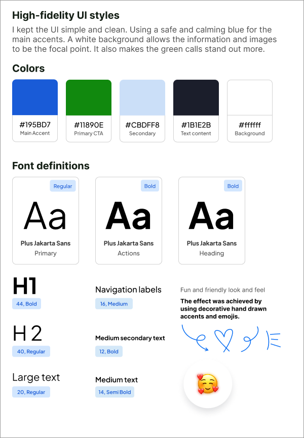
A high-fidelity style board defining the visual system, including color palette, typography scale, and UI styling decisions used to create a cohesive, accessible, and trustworthy interface.

What I Learned
Clarity is structural, not cosmetic. The original site didn't fail because of bad copy — it failed because the layout didn't guide the eye or sequence information in a way that built confidence.
Interview data changes designs in specific ways. Testing wireframes before committing to hi-fi saved rework and gave me evidence rather than assumptions to design from. Every major structural decision in the final wireframe traces directly to participant feedback.
Progressive commitment reduces drop-off. Replacing a phone-call requirement with a 3-step form isn't just more convenient — it's a different psychological ask. Small steps forward lead to completion.
Given more time, I'd run task-completion testing on the registration form with actual dog owners, measure where users drop off in the flow, and A/B test the CTA placement and language on the homepage.
Accessibility — Version 2.0
This case study was iterated to version 2.0 with a focus on accessibility. Updates include:
Semantic heading structure (H1 → H2 → H3) for screen reader navigation
Descriptive alt text on every image
Fully readable text content — no information is conveyed by image alone
WCAG AA color contrast compliance across the redesigned UI
Designing accessibly from the start — rather than retrofitting— was a core learning from this iteration.

You may also like

Back to Top